Overview
HiChee.com has evolved into a hub for comparing vacation rental rates, boasting over 13 million options from Airbnb, Booking.com, Vrbo, and other platforms, and directly from the host's site.
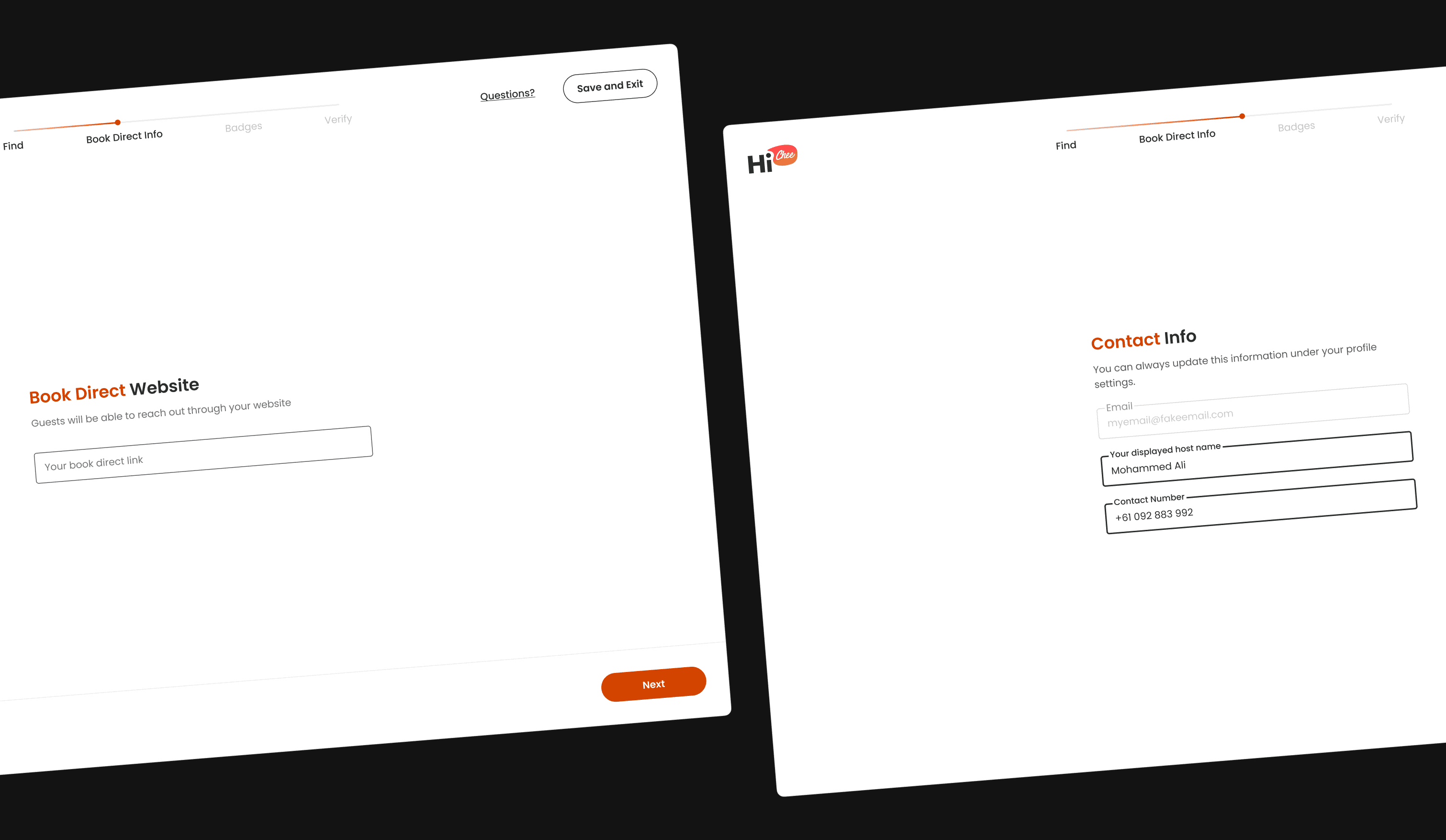
When verifying on HiChee hosts can add their Book Direct link, travellers can get in touch with them directly, for a personalised quote, and negotiate booking terms.
My contribution
Product strategy
UI/UX design
The team
1 × product manager
1 × product designer
3 × engineers
Year
2023 - 2024

01. Process
Goals
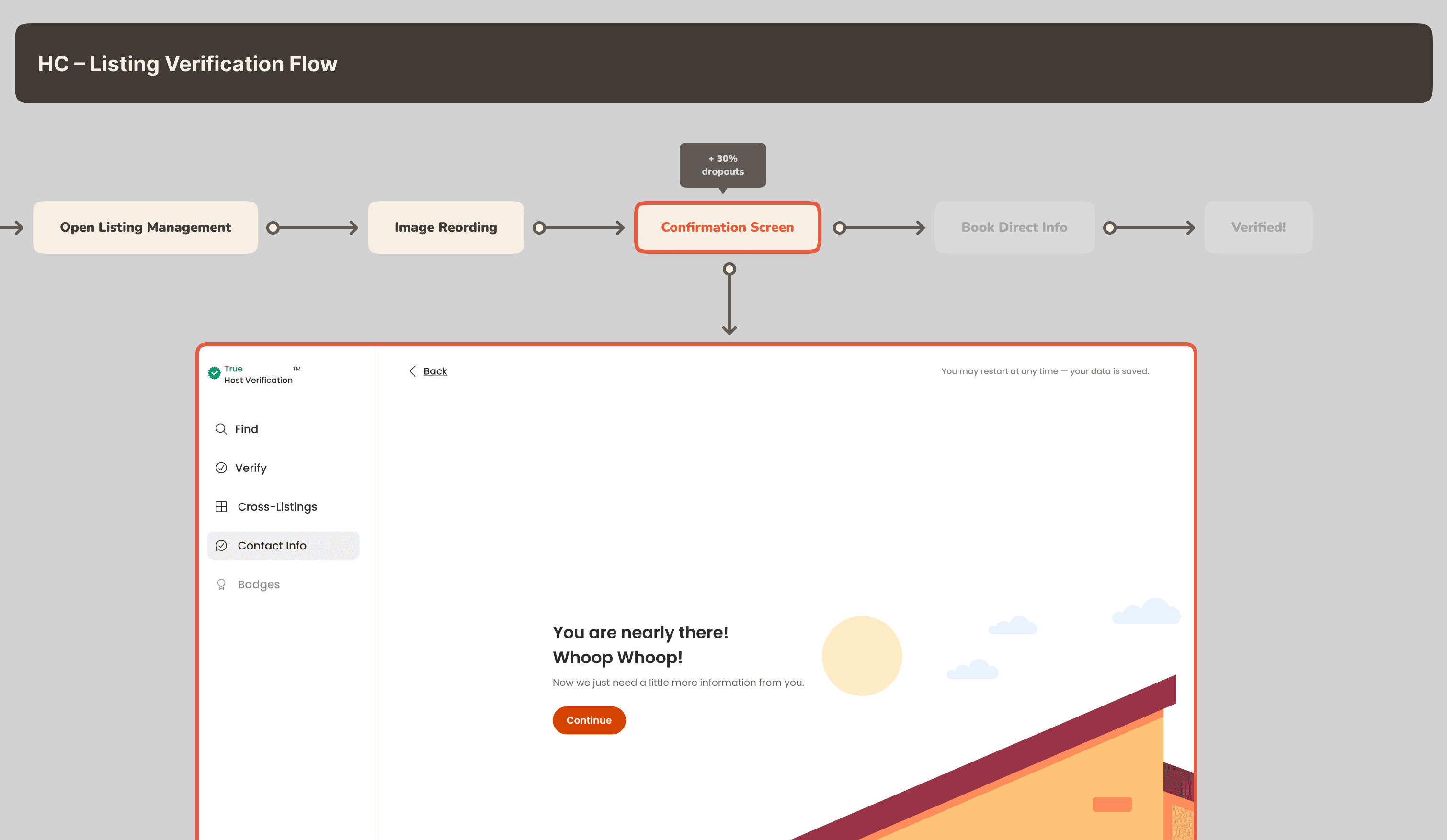
Our primary goal was to enhance the listing verification process. Previously, unclear steps led to a significant dropout rate, exceeding 30% according to our analytics data.
By making this process clear, and updating components to match our design system, we intend to increase the verification by at least 50% more than our current numbers.
Addressing Challenges
The listing verification process presents a unique challenge as it diverges from the typical user flow. Our goal has been to emulate a familiar experience akin to that of major industry players, ensuring user comfort and ease of navigation.
Additionally, our diverse target audience spans various ages and nationalities, necessitating thoughtful design decisions that accommodate a wide range of preferences and cultural backgrounds. Keeping these factors in mind, we strive to create a seamless and inclusive experience for all users.
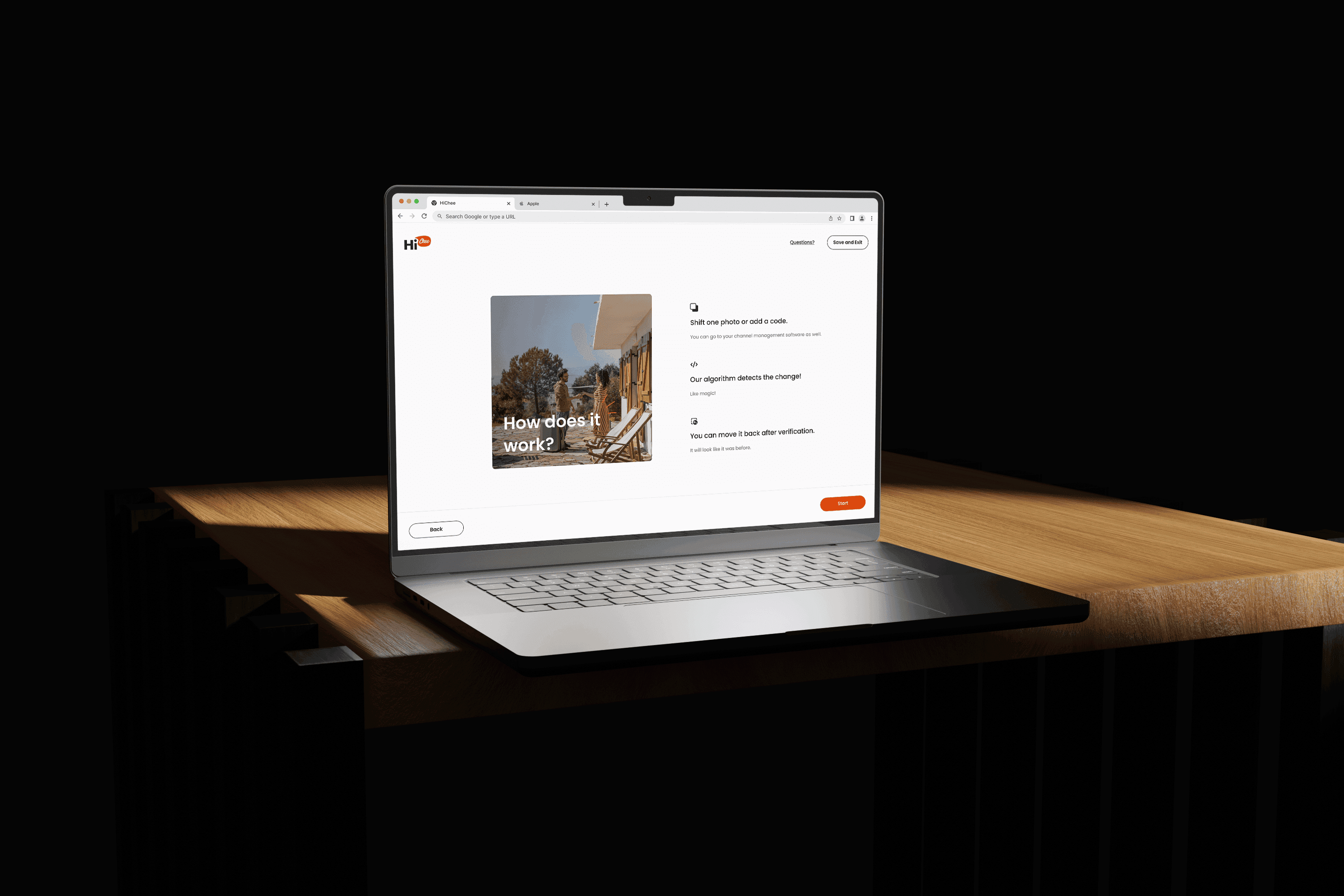
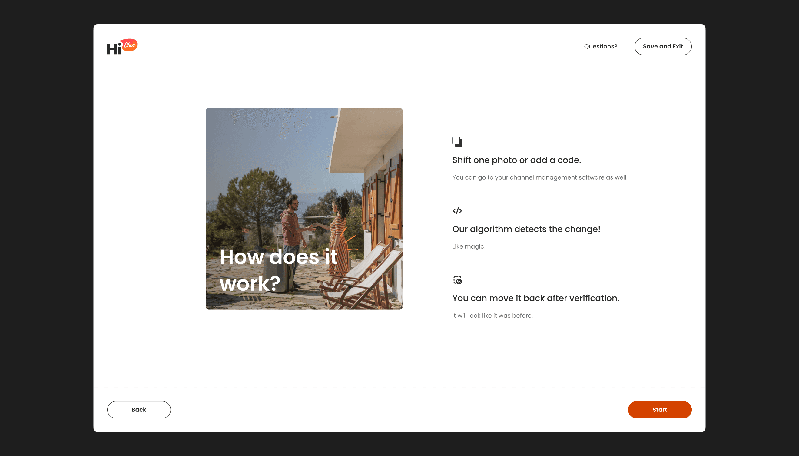
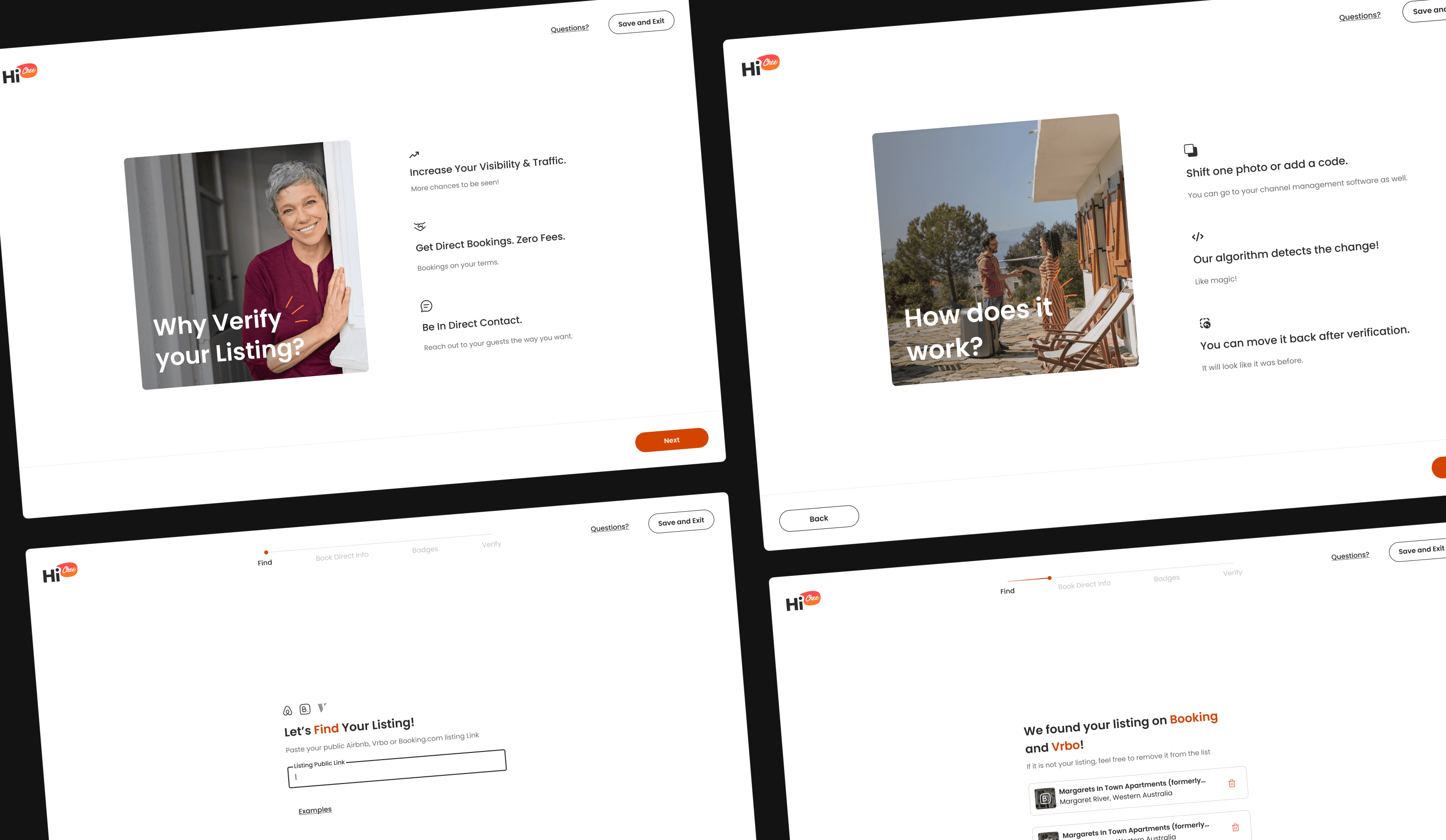
How Does the verification process work?
At HiChee, we streamline the verification process by leveraging data scraped from major players like Airbnb and Booking.com. With comprehensive information on all listings at our disposal, verifying ownership is a straightforward process, accomplished through a few simple steps.
02. Experience first
New flow
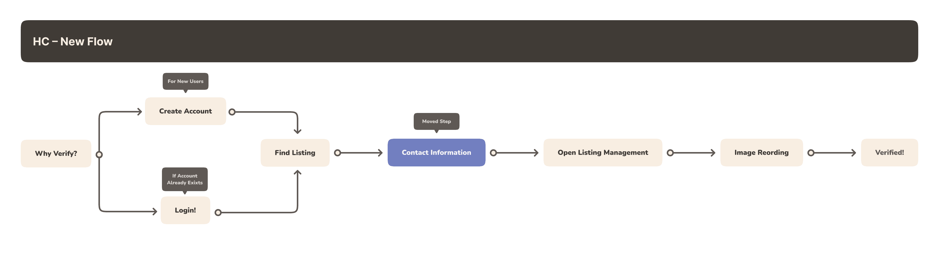
Collecting host contact information is paramount for the success of HiChee. Without it, we cannot offer a better deal for both parties involved. In light of this, we've restructured the flow:
Gather host information at the outset.
Postpone the confirmation step until the conclusion of
Collaborating with the internal team and users
I closely collaborated with our customer support representative throughout the process to gather as much user feedback as possible.
Establishing a solid base
After analysing our current analytics data and gathering feedback from users, it became apparent that our verification process faced certain bottlenecks:
Unclear messaging
Redundant steps and confirmation messages
Confusing navigation
Moreover, it became evident that the navigation was confusing, as the visual language did not align with the rest of the website's experience. We took this opportunity to revamp our UI.
03. Hands-on!
Matching our design system
In aligning with our new design system, we've seamlessly integrated the revamped flow into HiChee's interface, enhancing both functionality and aesthetics.
By adopting a more modern design language, we ensure a cohesive and consistent user experience across the platform. This update not only improves user navigation but also reinforces brand identity and credibility.
With a sleeker interface and streamlined process, we anticipate increased user engagement and satisfaction, ultimately driving higher conversion rates and bolstering HiChee's competitive edge in the market.
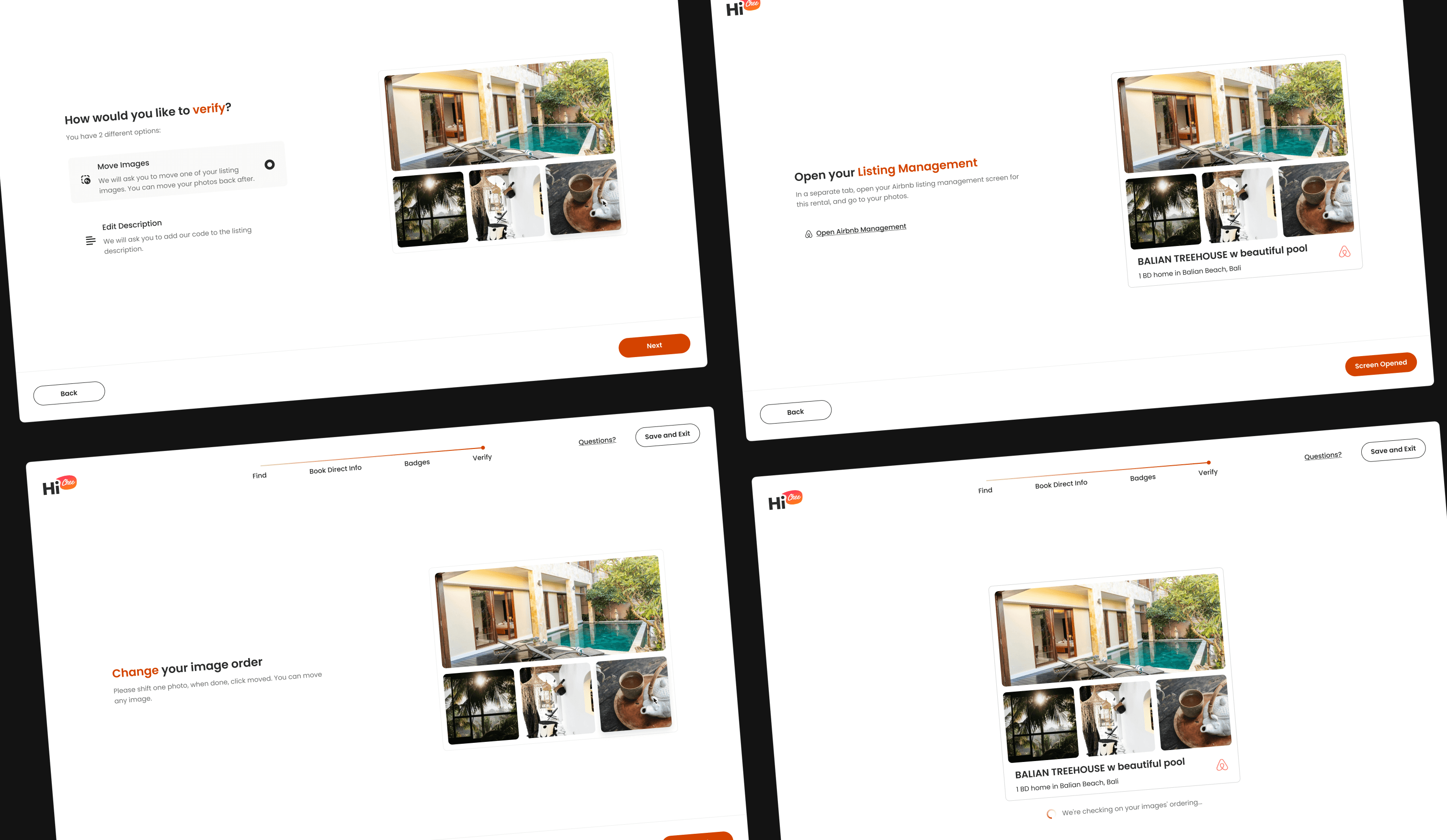
Micro-interactions and Animations
To enhance user understanding of each step, I integrated simple, contextually relevant animations. This departure from the previous UI, where users often felt uncertain about their next actions, aims to provide clearer guidance throughout the process.
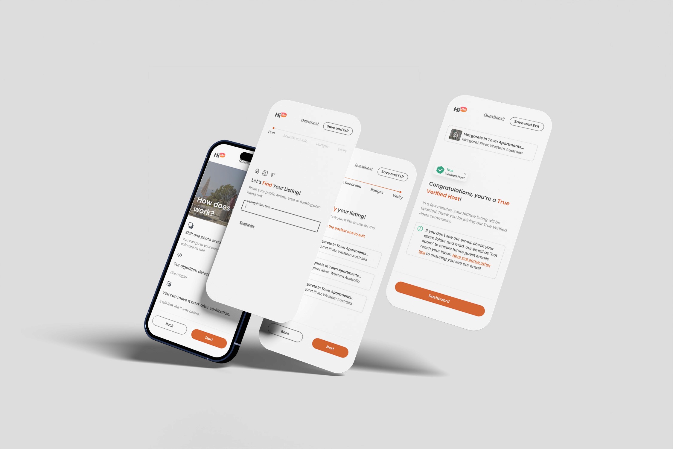
Responsiveness
With users accessing our verification process across a diverse range of screen sizes and browsers, adaptability is key. Our analytics indicate that half of our users utilize desktops, with 1280 pixels being the prevailing resolution, while the other half access the process via mobile phones.
In response, we've prioritised ensuring a seamless experience across all devices, guaranteeing accessibility and functionality regardless of the platform.
04. Conclusion
What's next?
Embarking on the listing verification project has been both exhilarating and challenging. However, we're not just stopping at the initial hurdles; instead, we're diving deeper into the process, embracing iterative improvements to ensure a top-notch user experience. Our approach involves implementing changes in phases, beginning with a reordering of the verification flow within the existing UI. This allows us to swiftly address immediate concerns while laying the groundwork for broader enhancements. As we progress, we're not only refining the front-end but also integrating feedback from our users, ensuring that every update aligns with the best design principles.
We're thrilled to share that the journey has already yielded positive feedback from two users, motivating us to continue pushing boundaries and delivering a verification experience that exceeds expectations. Stay tuned as we navigate this exciting journey of evolution and innovation!